In Testing: A New Tool for Emotional Vocabulary
The average person living in the United States only uses between 5-10 emotion words to describe all of their feelings. “Fine” and “okay” cover a multitude of “states of being,” which isn’t particularly helpful and can actually be bad for your mental health.
I wanted to create a customizable map or chart that helps you both identify the words that feel most authentic to your vocabulary and experience, while also giving you a sort of visual assessment of where you might have gaps in your emotional vocabulary—space to work on refining and expanding the words you use to describe the wide variety of feelings and emotions you experience but maybe don’t notice or name. Yet.
So I built a tool—a Personalized Emotions Map (v1)—that aims to help. It will take just three to four minutes to complete.
Once you’ve created your own map, take a few minutes to reflect:
What about my map was expected? What is surprising?
Where do I see any areas of strength (high volume of words) and gaps in my emotional vocabulary?
What did you like about this tool? What advice would you give me for improving it in future versions?
After creating your Personalized Emotions Map, be sure to save it (download or take a screenshot). Next, hit the button below and let me know about your experience, thoughts, and advice to help improve this tool.
Personalized Emotions Map (v.1)

No data is being collected about you or your emotions map.
I’m only tracking how many maps are created.
If that changes, I’ll create a new privacy note here.
Want More Context?
Why your emotional vocabulary matters
In the research world, psychologists talk about “emotional granularity” or “differentiation of emotions.” Essentially, how well can you identify, label, and describe different emotions with some degree of precision—rather than using broad or overly vague terms like “fine, okay, or bad.”
The research is pretty clear:
Specific labeling of negative emotions protects mental health. Studies show that being able to name a difference between negative emotions and feelings is strongly linked to lower levels of depression and overall mental well-being, especially during times of high stress.
Emotional Granularity helps people regulate stress in real time. Naming specific emotions doesn’t eliminate difficult feelings, but it does act as a protective buffer against stress. It can lead to improved sleep, emotional regulation, and help prevent harmful coping mechanisms like binge eating, alcohol abuse, or catastrophizing.
High Emotional Granularity improves treatment outcomes. People with higher emotional granularity get more benefit from talk therapy and are more likely to stick with medical and mental health recommendations and support when experiencing distress.
Emotional granularity is a trainable skill: This is not a fixed trait—it can be actively built through mindfulness, expanding your emotional vocabulary, and regularly tracking daily emotions and feelings. Being able to articulate the difference between “regretful” and “hopeless” means you can take more specific actions to help you move through the emotion, rather than labelling every low-energy, unpleasant emotion as “sad.”
Other Emotion Identification Tools
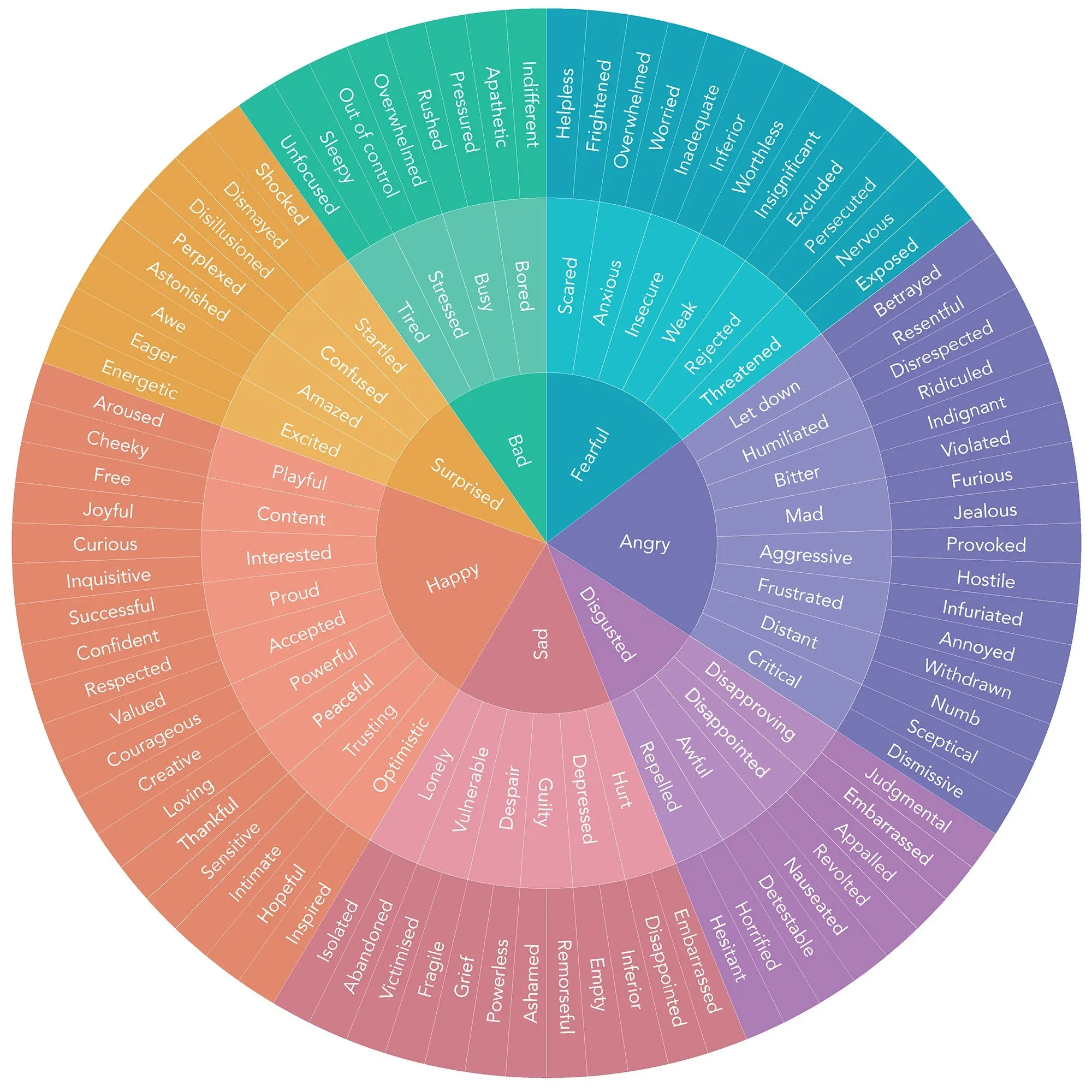
A lot of people are familiar with the Emotions Wheel.
It can be a helpful tool to see a wide range of emotional vocabulary words. I think it falls short in that it’s organized in a way that doesn’t actually help me quickly find a word or phrase that matches what I’m feeling—especially if I don’t already have a specific word I’m looking for.
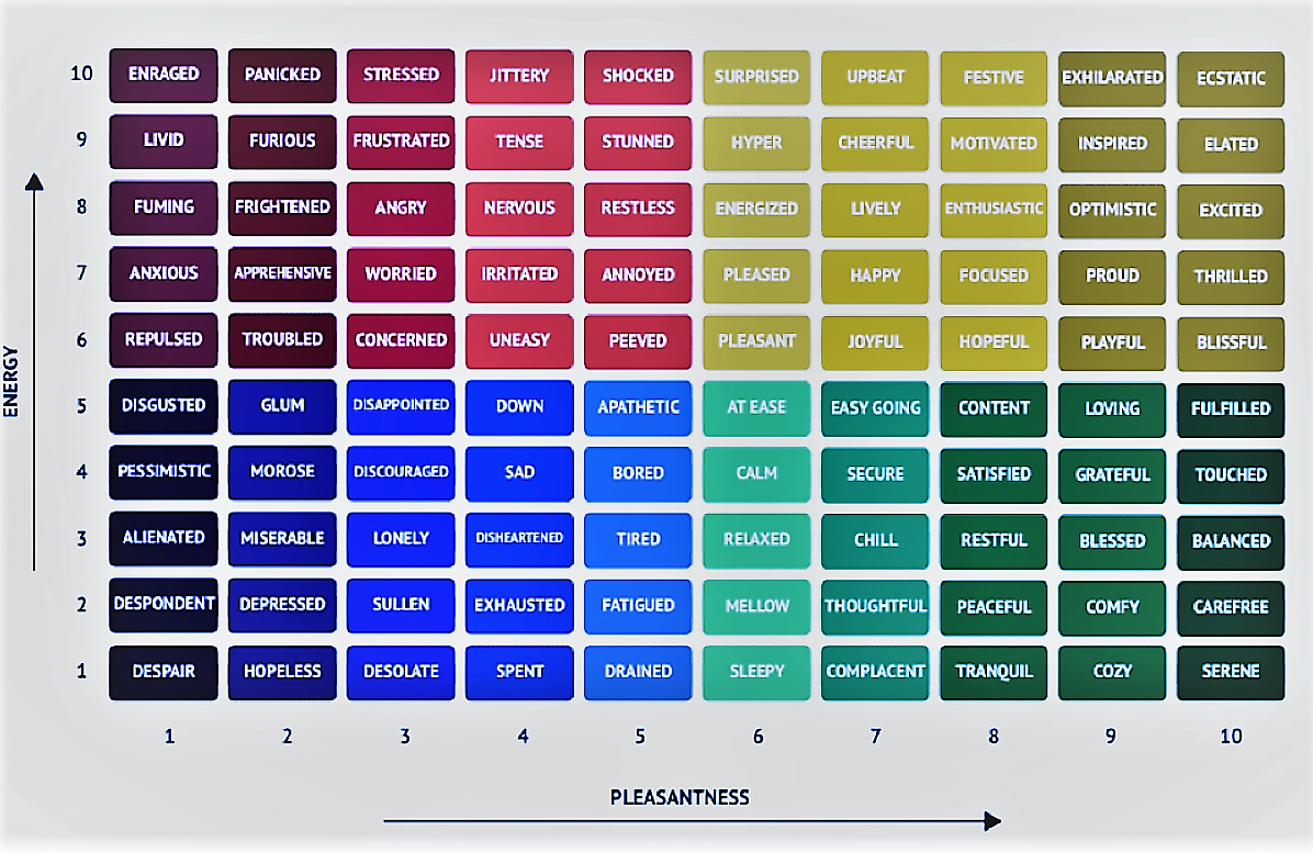
The Mood Meter is a helpful improvement, orienting people to a more embodied experience—the axes are two spectrums, pleasant to unpleasant and high energy to low energy. You can use your embodied experience to navigate to the right area of the chart and find a cluster of words that might be pretty close to describing what you are feeling. But the preset terms may not resonate for you, leaving parts of the chart unused and distracting to you.